Manor Ltd. - Case Study
Background
The case study in this section was created as an accompaniment to an assignment for VIU’s Masters of Business Administration (MBA). It was then further refined to showcase my abilities as a product designer for the fictitious company, Manor Ltd.
My Role - Product Designer (UX/UI)
Project Timeline: Two Months
As product designer, I worked with two MBA students to create an application for their company Manor Ltd. Manor is a social media platform and marketplace which seeks to empower and connect artists, galleries, collectors, and enthusiasts of art under a single roof. Their mission is to encourage and expand the communication around art and open further avenues for engaging in the procurement and sale of artwork. As such, they are well situated in an old market with change on the horizon.
Competitive Analysis
In a market poised for change, zeitgeist has already begun to take effect. Other applications with similar goals have begun to pop up in the space. Manor’s main competitors are: Artsy, Artfare, and Etsy.
-
Artsy
Artsy hosts auctions and sells artwork for galleries and caters to the high end art market.
-
Artfare
Artfare connects its users and locals together with a focus on highlighting gallery events and selling artworks locally.
-
Etsy
Etsy offers inexpensive commission rates of 5% and hosts a large volume of items and artwork for sale.
Condense the USP (unique selling point) of Manor
Lower commission rate than most competitors (5%)
Hosts virtual gallery spaces for artists, galleries, and collectors to display and sell their artworks.
Features augmented reality to view artwork in a space to boost user confidence in purchases.
Encourages users to connect with one another openly and facilitates discourse around artworks and artists.
Brand Strategy
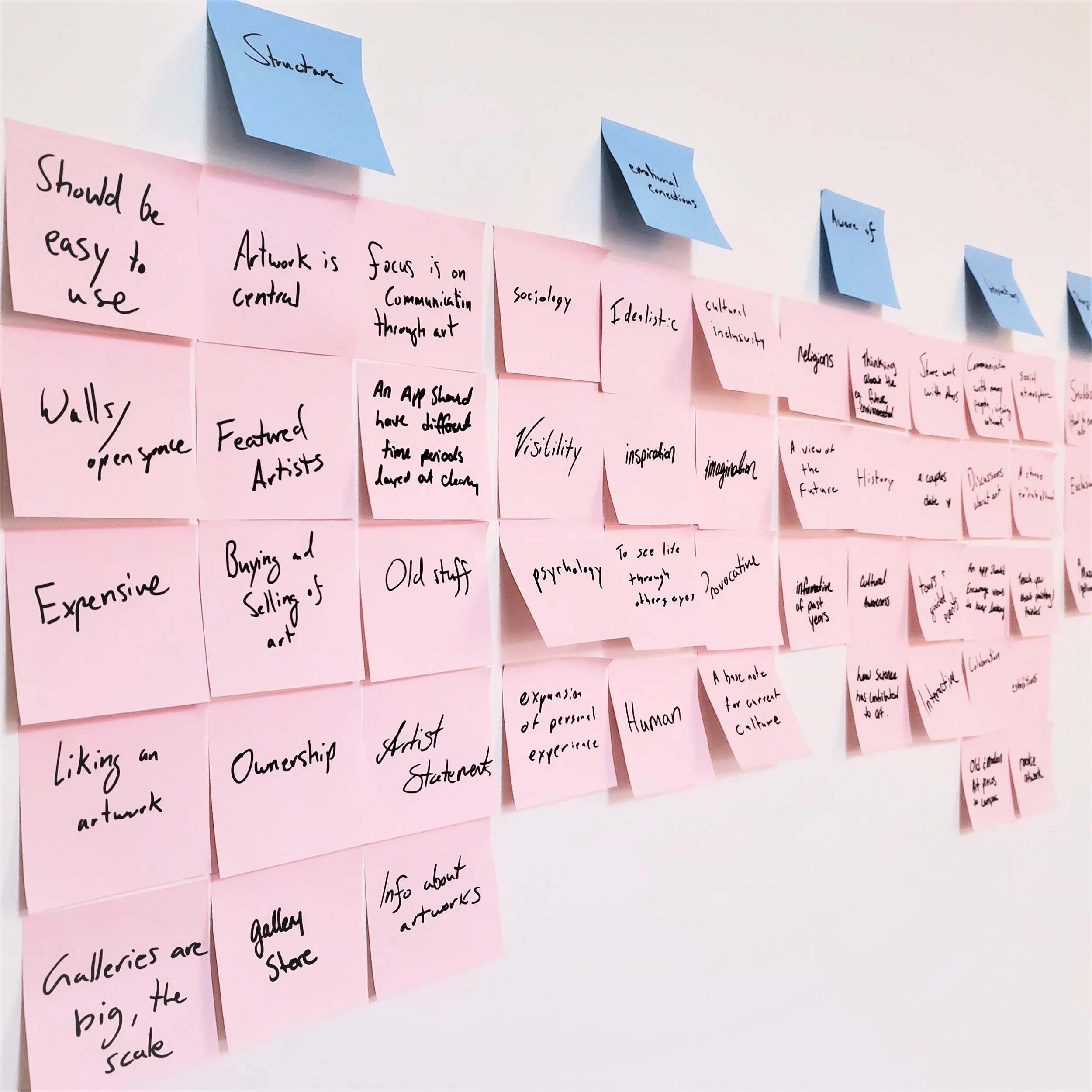
We began by listing and organizing the assumptions we had about how galleries function, and what a platform for selling artwork should look like. This then informed what our key deliverables should be throughout the design process. An affinity board was essential for us to get a top down view of our company’s goals and discovered communication and interactions to be at the very heart of what we would be developing. Our brand, while utilizing a similar feature set as our competitors, will differentiate itself by acting as a communications platform with a focus on artworks. Additionally, the implementation of augmented reality to view artworks in your own home will further the sale of artworks over our competition.
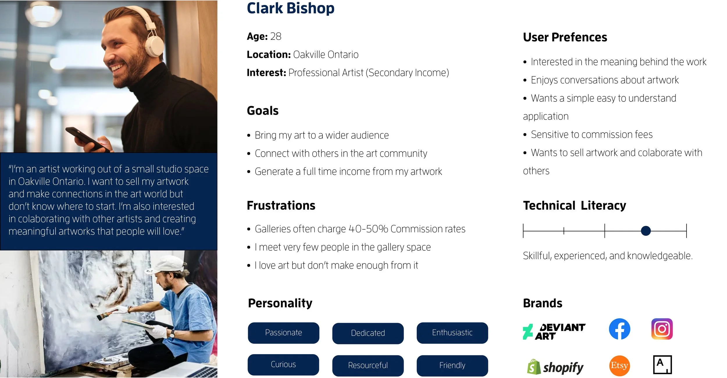
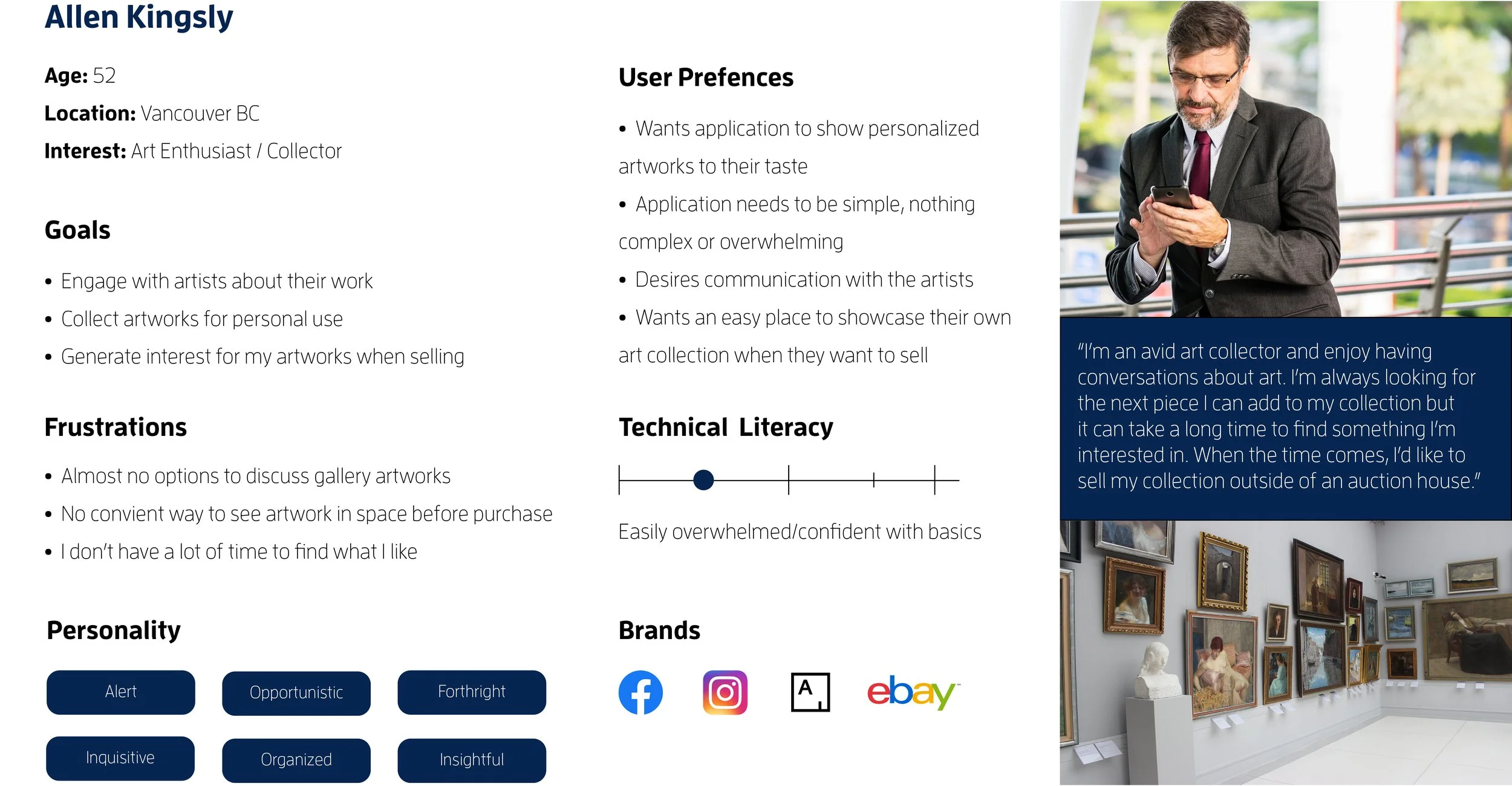
Target Group Personas
I built personas based on market research, for who would be the most likely candidates to engage with our platform. These would be used to great effect when informing the overall sitemap to limit user pains and aid in generating user gains. Ultimately providing a more pleasurable user experience. This is an essential goal for myself as a designer that employs a human centred design philosophy.
Visual Style
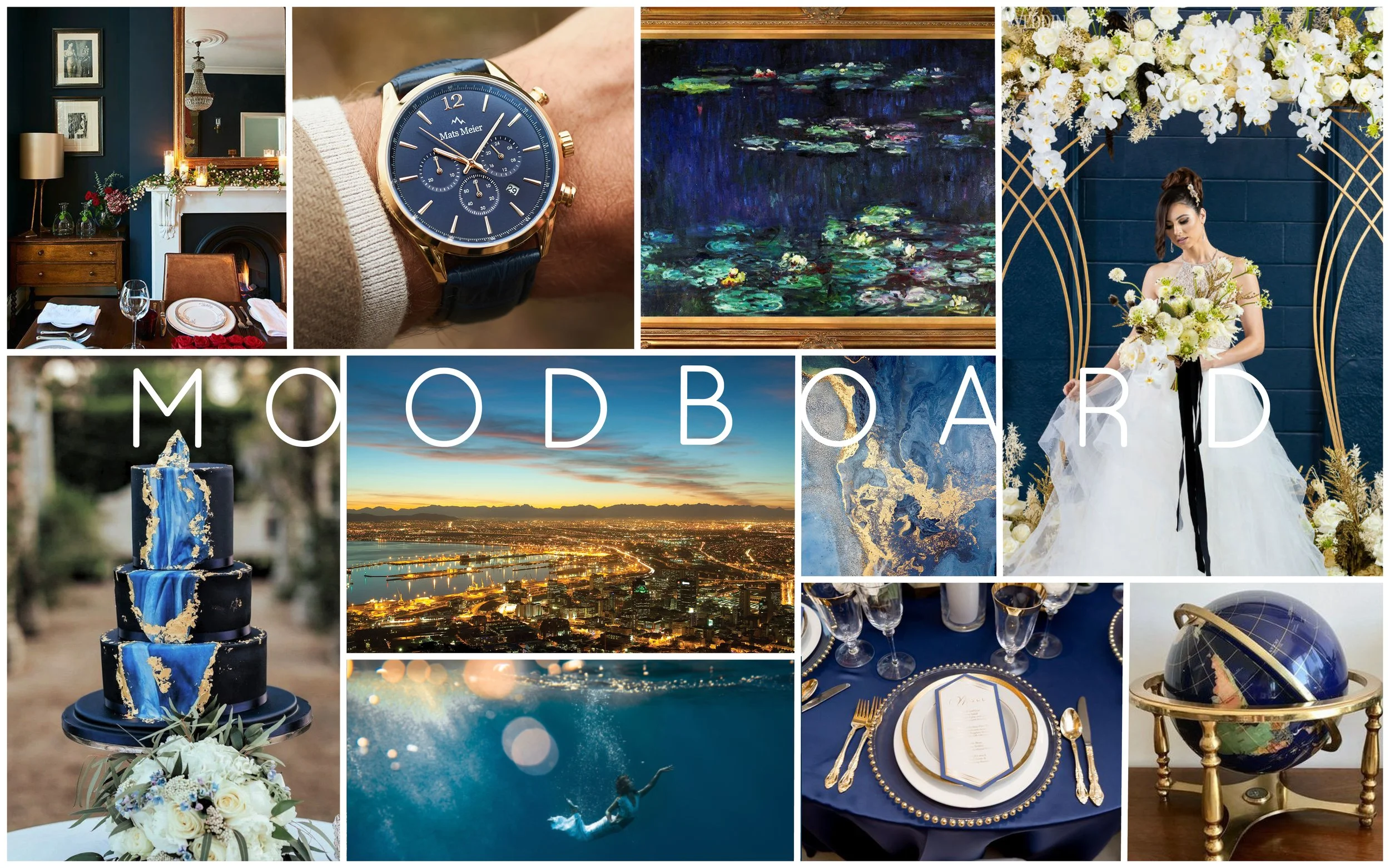
By developing a mood board, this aided the overall vision of the project and would be used to generate the style guide in the future. Deep blues and golds were the main colours as sophistication and quality became central to the brand’s image after much deliberation.
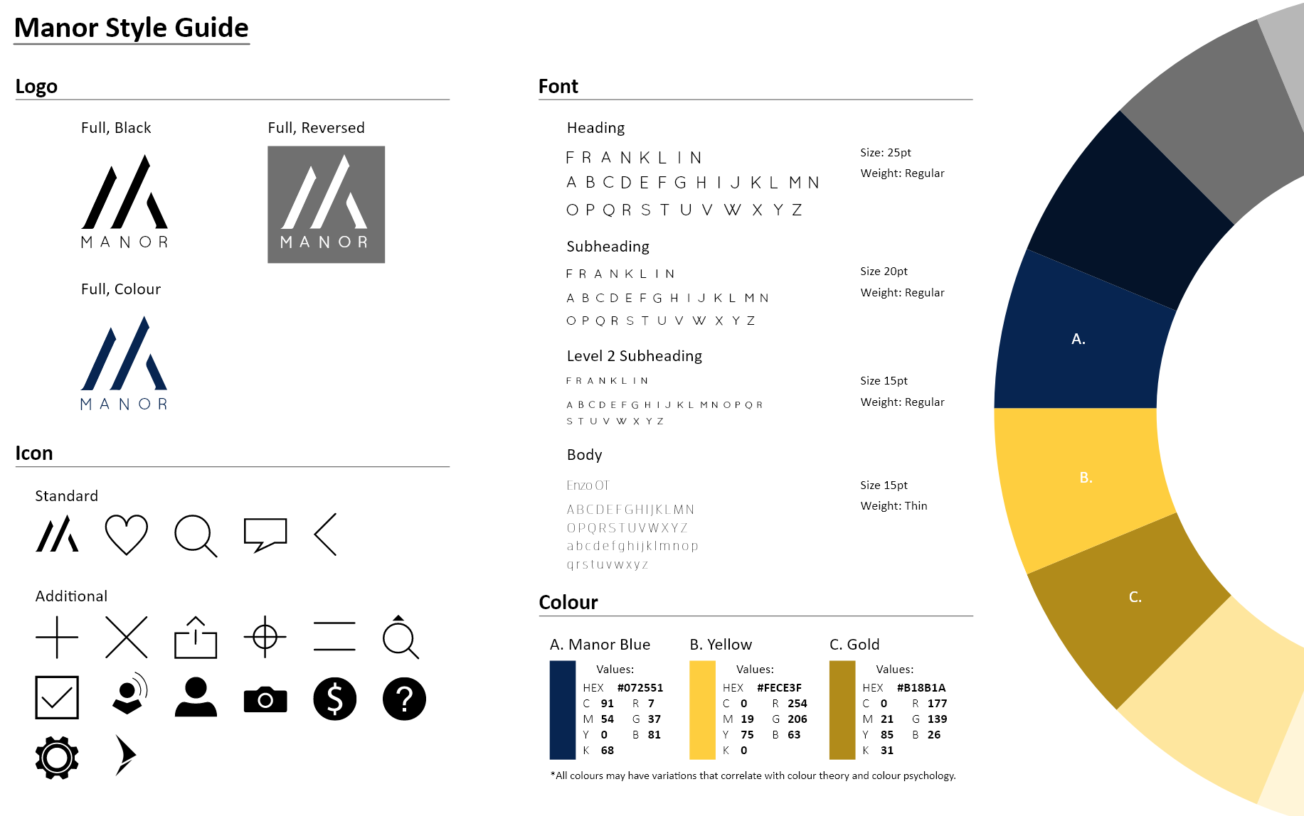
The style guide for the application centred around a minimalist design philosophy, with sharp sans serif fonts being selected throughout the process. Along with the selected colours, these create a focussed, elegant, and easily understood application layout.
Information Architecture (sitemap)
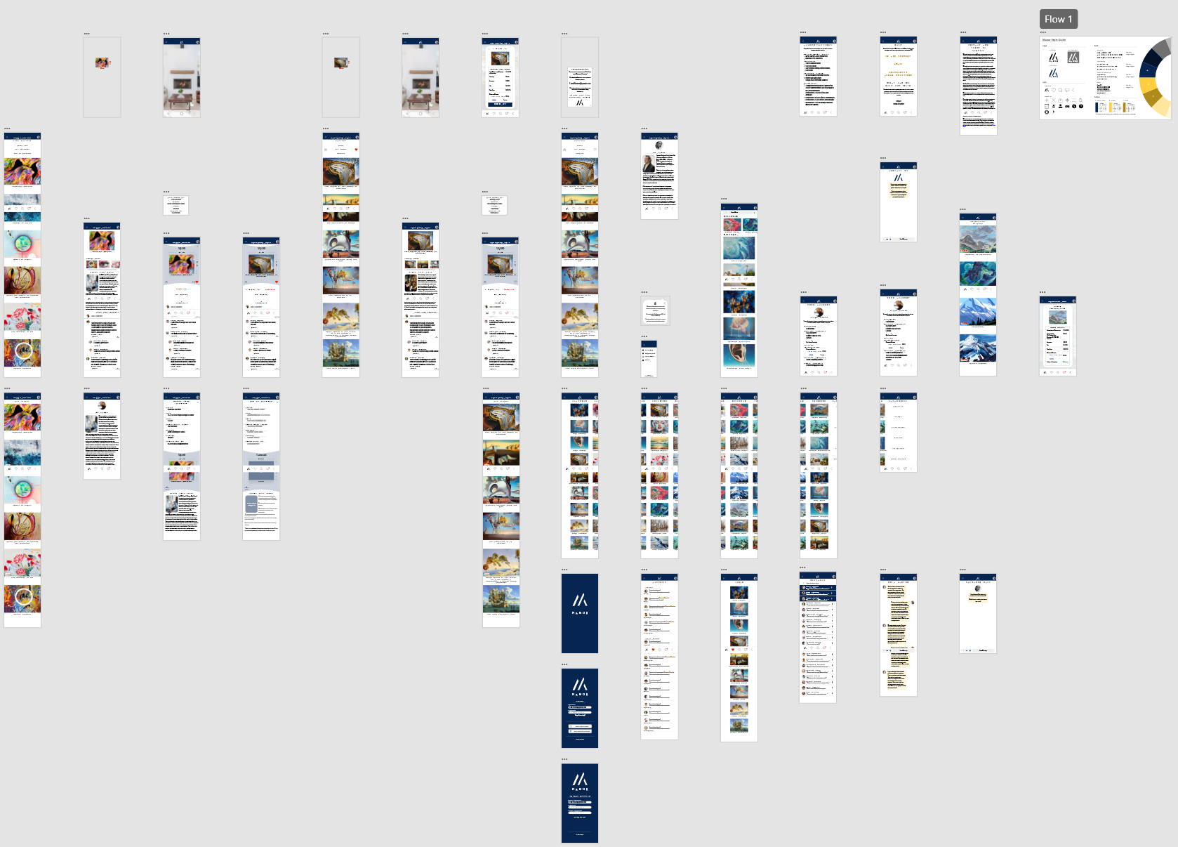
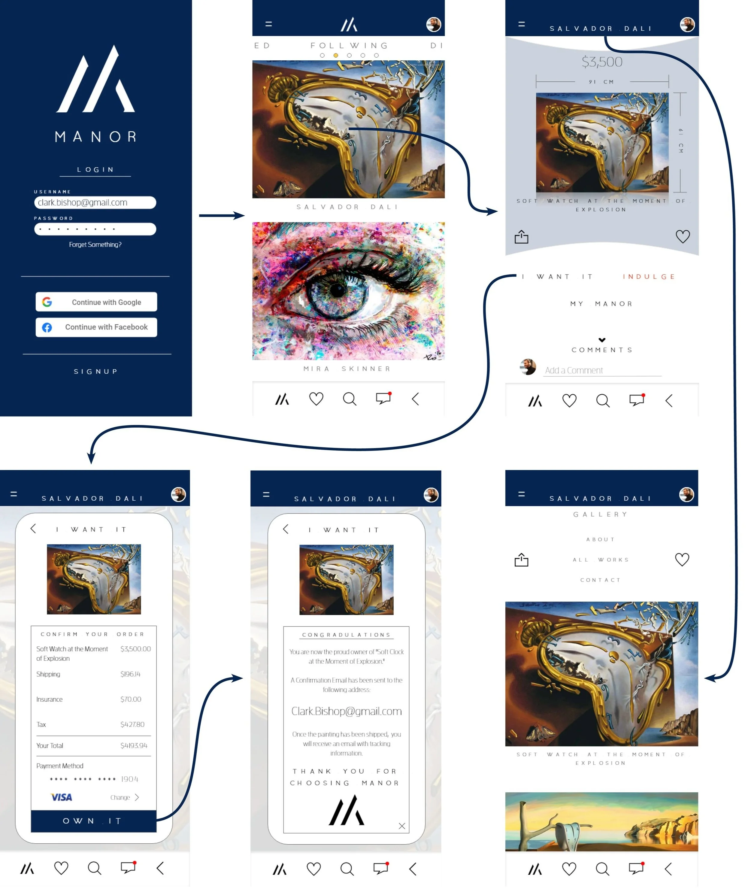
Utilizing the information gained from the personas as well as the affinity board, I constructed the sitemap with which the app would be built around. The application was designed to be easily navigable for users with seldom technical literacy.
I completed the application’s design in Adobe XD and Adobe Illustrator. When the prototype was completed, we moved onto testing and further iteration of our design.
User Testing
Qualitative testing
Qualitative testing was carried out on 5 individuals who most closely represented our user personas for our application.
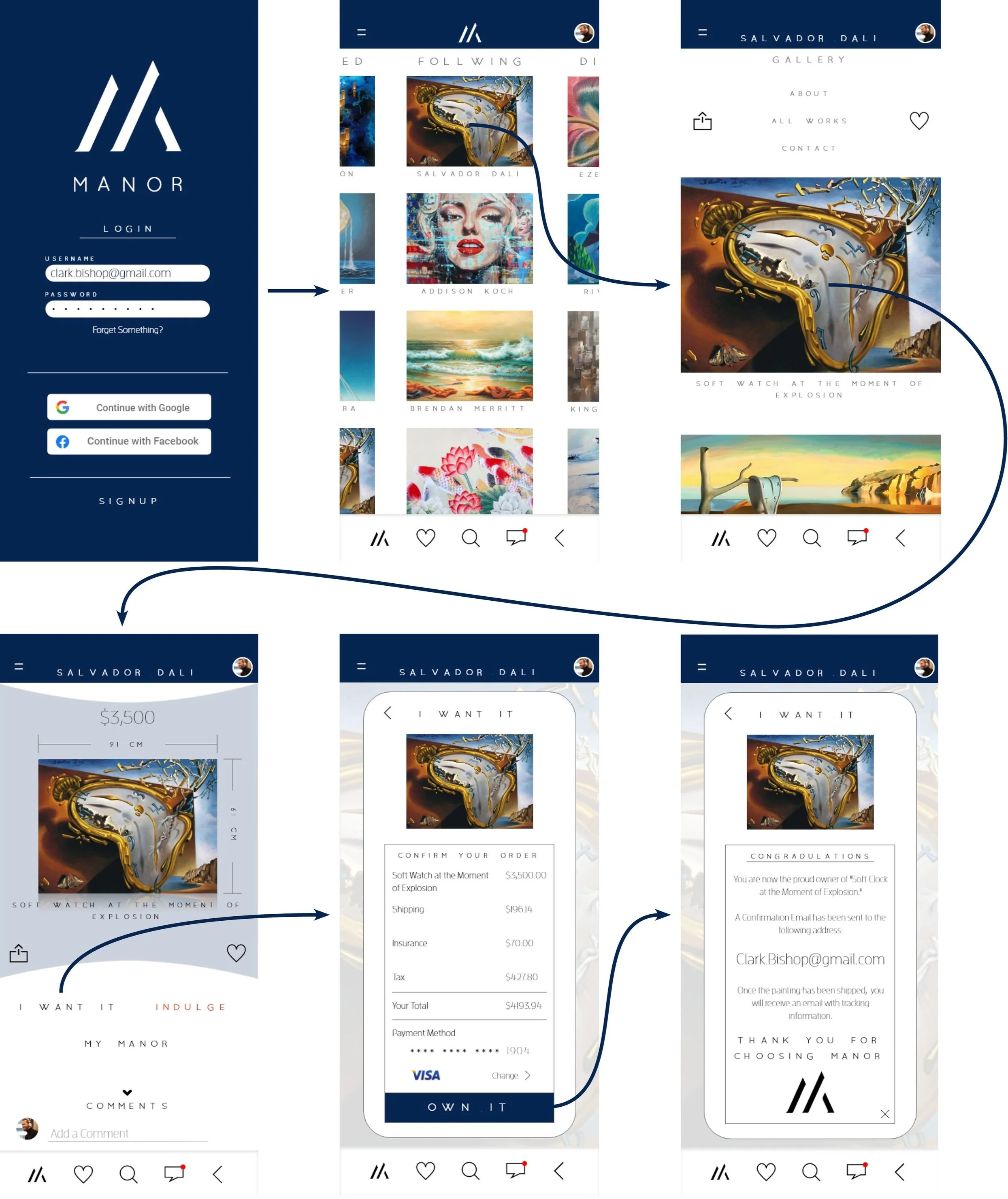
Upon testing, individuals were seen leaning into their device on the main home pages. This indicated that the images needed to take up a larger proportion of the display. Signifying edges of other paintings should be removed to accommodate a new smaller signifier that can take its place elsewhere on the display. Furthermore, an additional step to get to the artwork was identified through testing. In order to limit user pains, the artist’s gallery page could be removed from the user flow chart to optimize for purchases and engagement.
Iteration
Changes to the application involved adding a small page signifier to the top of the home page in order to aid the user’s conceptual model of Manor’s features. Furthermore, the artist gallery page was moved after the artwork in the sitemap. These changes would limit user pains in future rounds of user testing to bring the product to market.
Conclusions
Without running additional rounds of testing, the application is in its final state (though future adjustments could be made to improve the product). In this state, the app is ready to be fully developed should a timeline prohibit further testing. I would expect this application to be highly competitive in the marketplace where others are already present. The feature set of the application has been precisely developed to facilitate user engagement keeping them within the app for longer periods of time. Few areas of user pains subsequently create an enjoyable experience for the consumers of this product.
Future Adjustments
More changes to the home page could be made, especially around the aspect ratios of the paintings. This change would have significant consequences for the whole of the application and may be done to further increase user accessibility. A series of AB testing would likely be the best method to identify the most ideal ratios for this application; recommendations for testing are 1:1, 4:3, and 16:9. Additionally, to improve sales at a lower cost to the users, a design commerce platform such as Society 6, could be integrated into the “I want it” sub menu.
Final Thoughts
With fewer barriers to making a purchase, user sales and engagement are expected to increase with the changes made. The recommended alterations will also generate further income for the company should they be implemented into the final designs of the application. This case study provided an ample platform to exhibit my understanding of the design process with tight constrains on intended users, time, and product outcomes. The most challenging aspect of this study was identifying a specific user profile after combing though market research conducted by my other team members. There didn’t appear to be a single unified user base and as such, two user personas were created to outline the inconsistencies in our research. I thoroughly enjoyed this process and look forward to any future design work that may result from it.
